VEINCENTRE •
VEINCENTRE •
Changing attitudes towards varicose vein treatment
The client ask
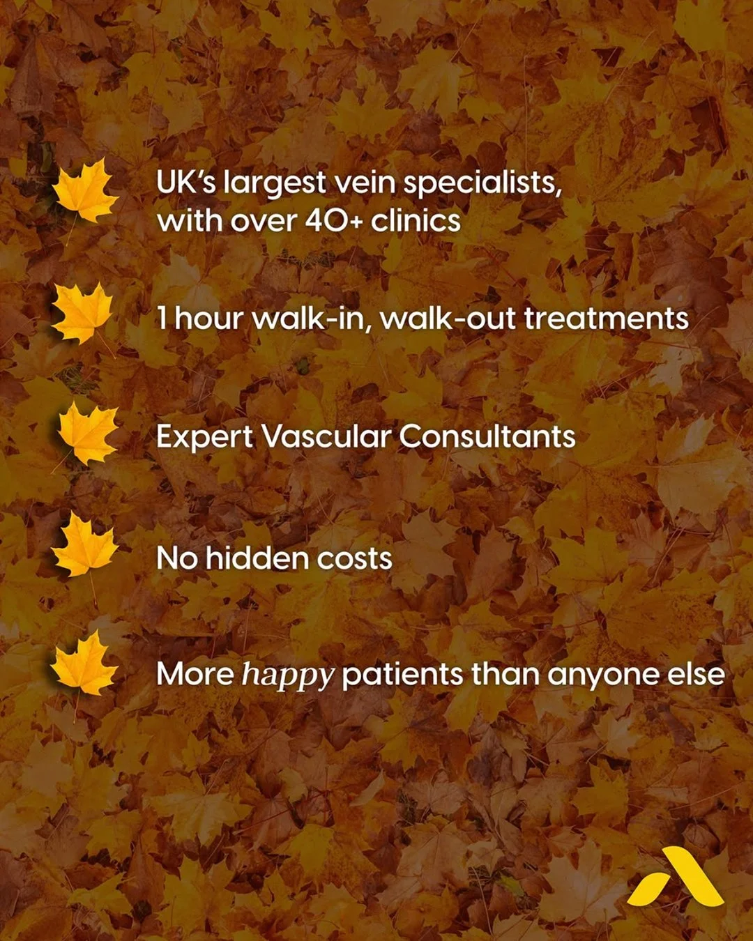
Veincentre are the UK's biggest vein treatment centre, but with other providers looking and sounding a lot like them, they needed to find a way to stand out from an increasingly competitive market.
The brief
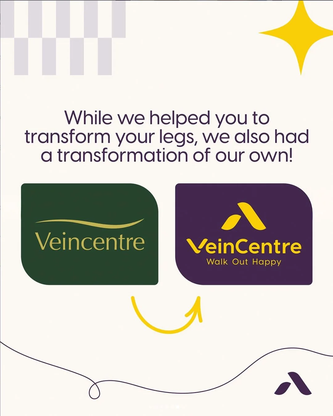
A total rebrand (other than the name). Starting with a brand line that can create a tone to feel welcoming, understanding and reassuring.
The creative solution:
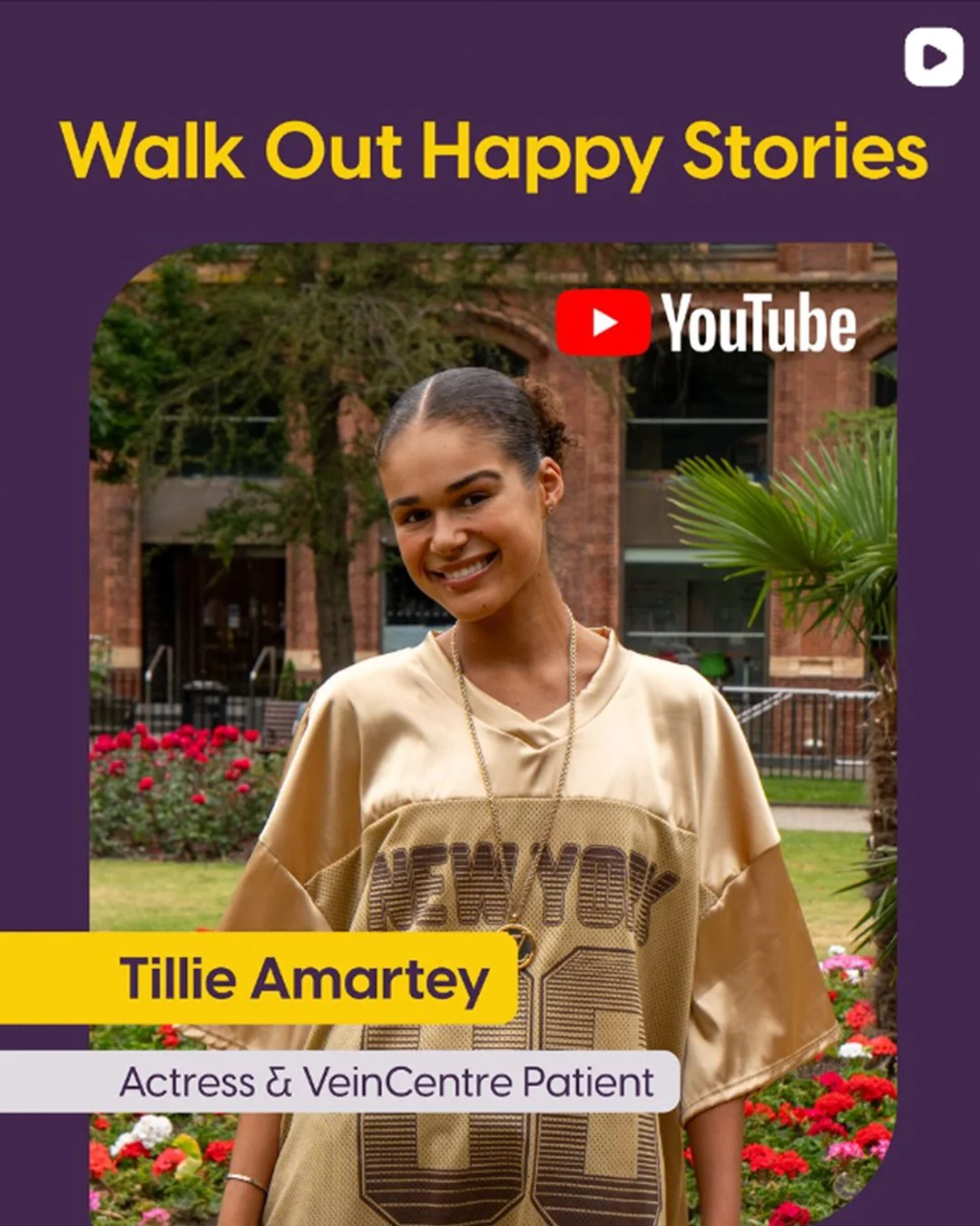
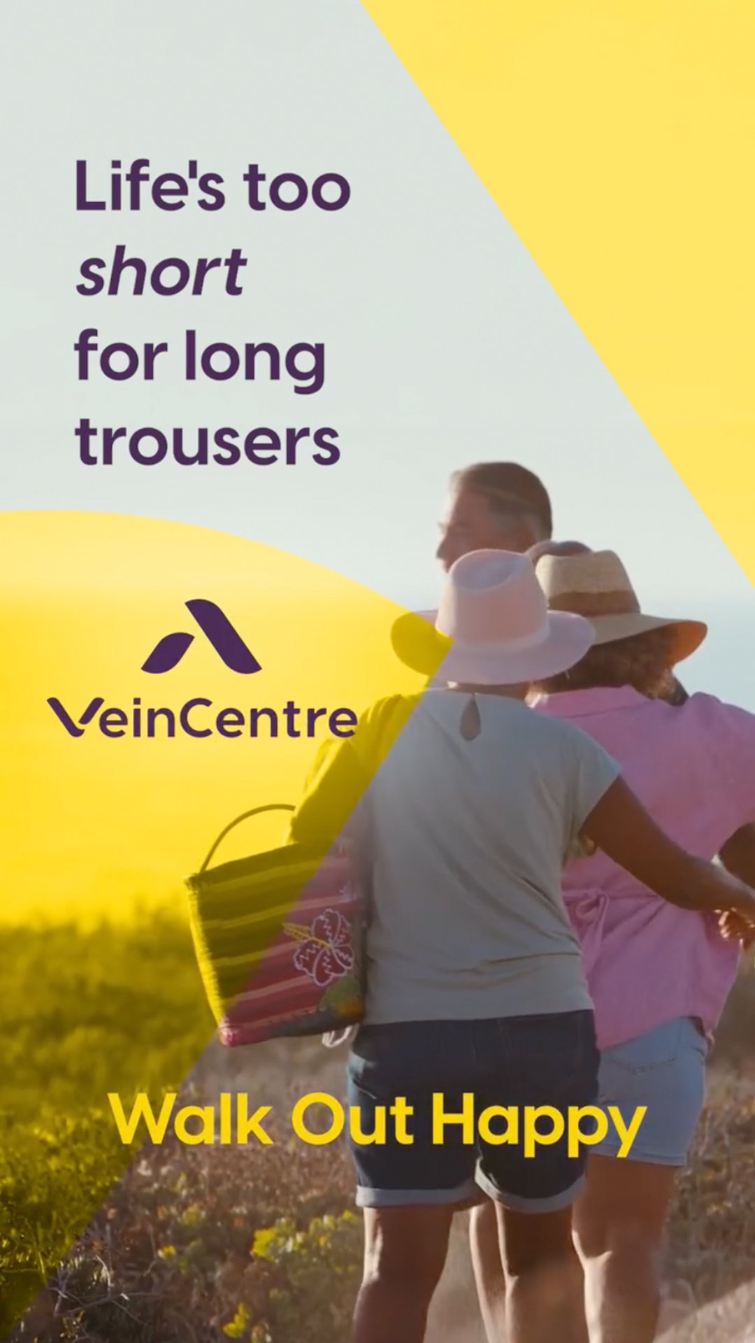
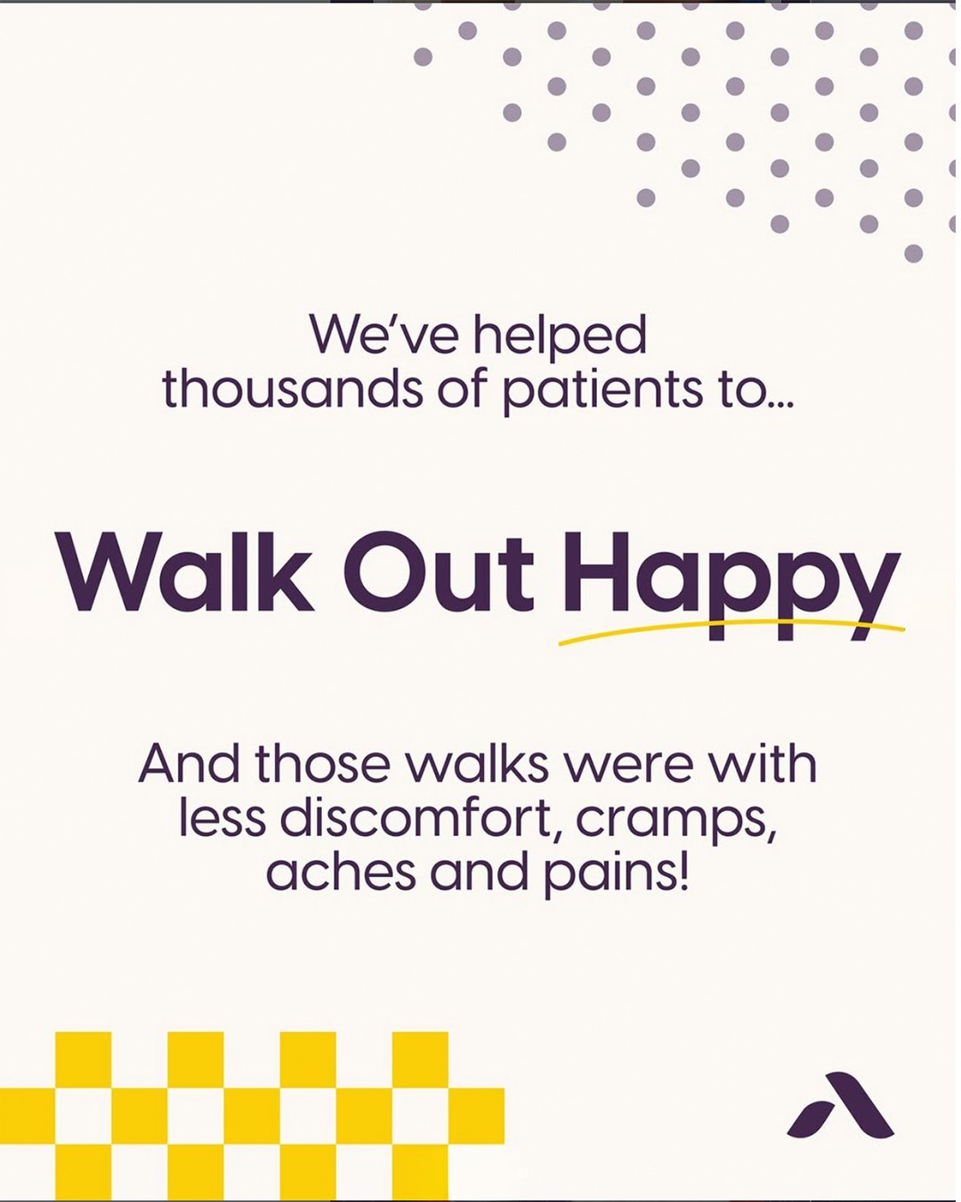
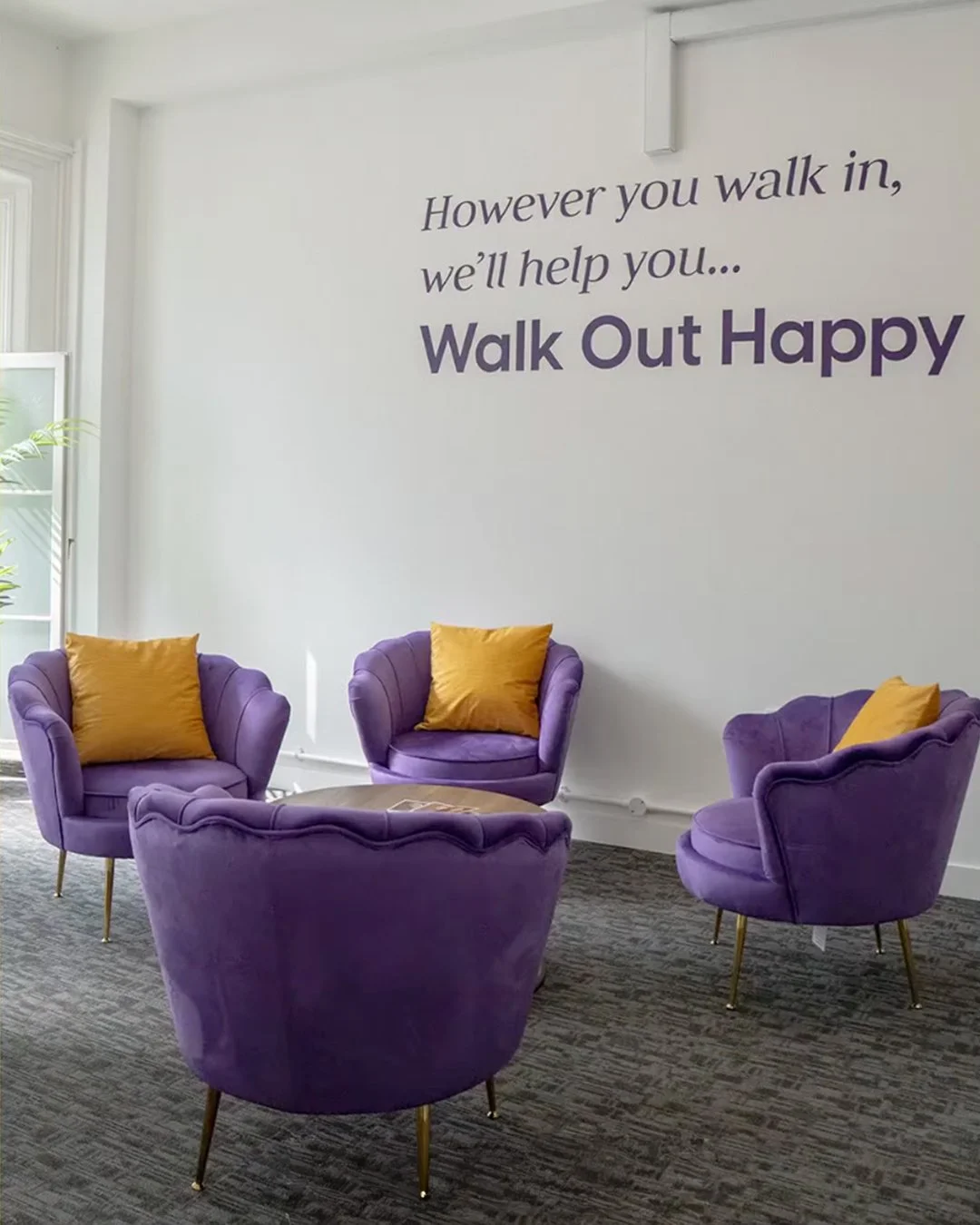
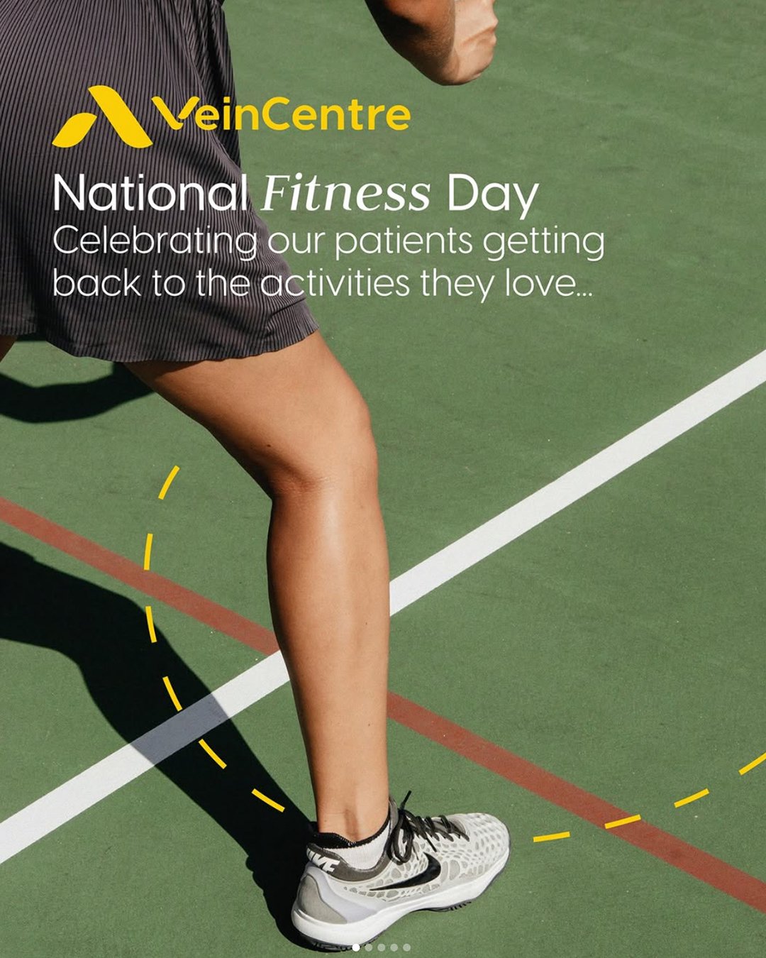
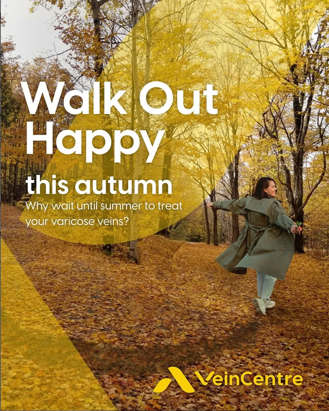
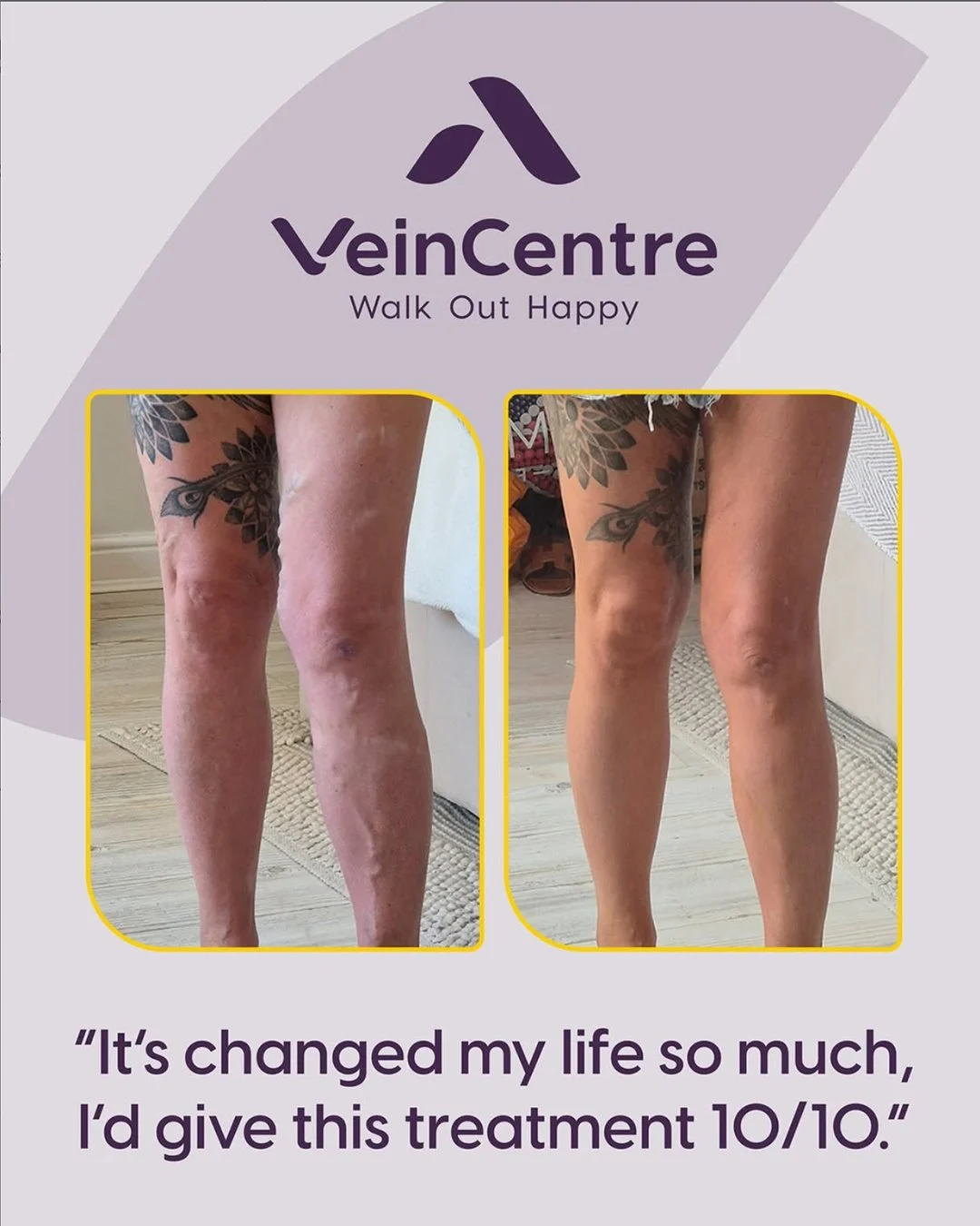
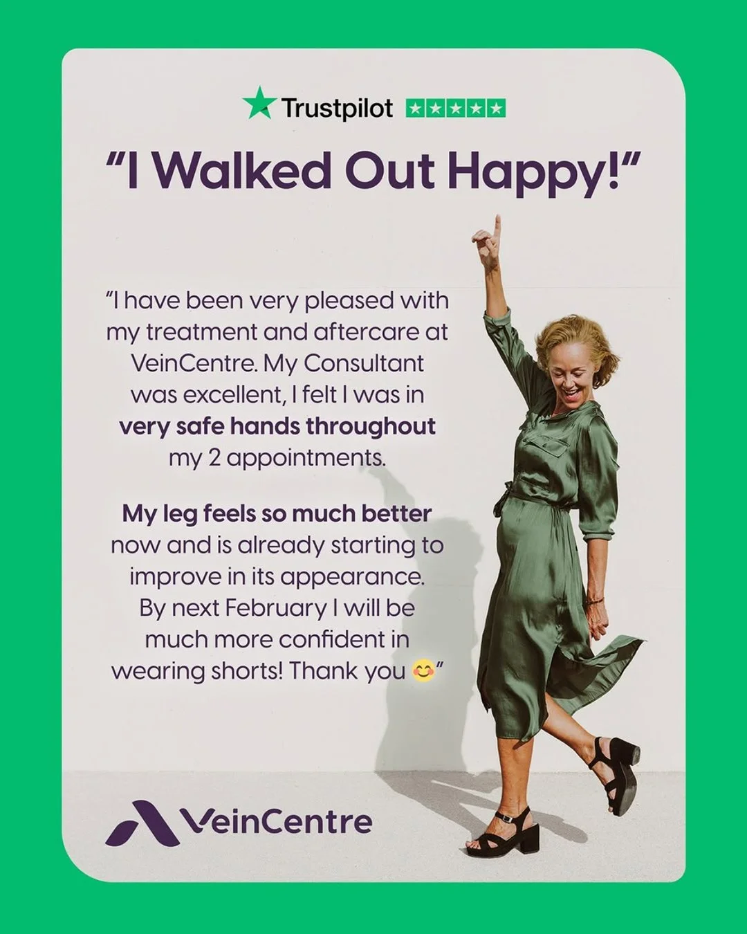
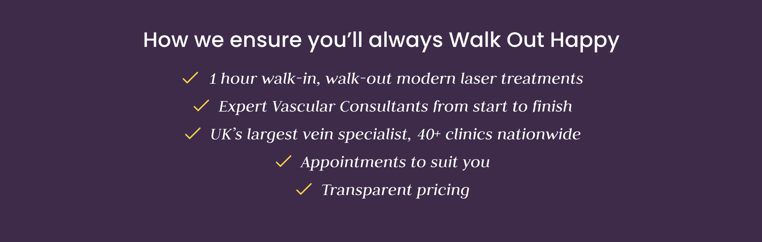
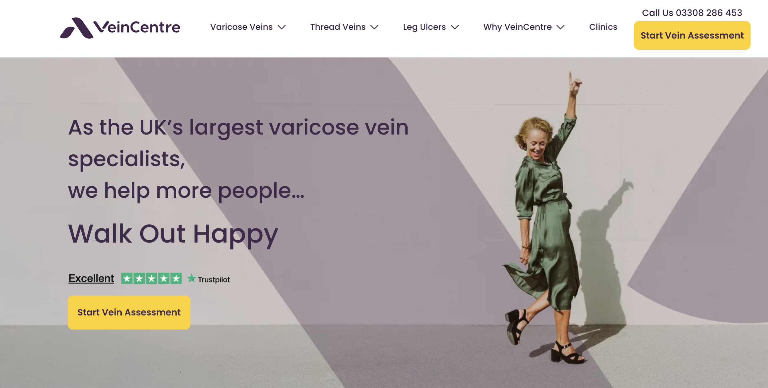
Walk out Happy
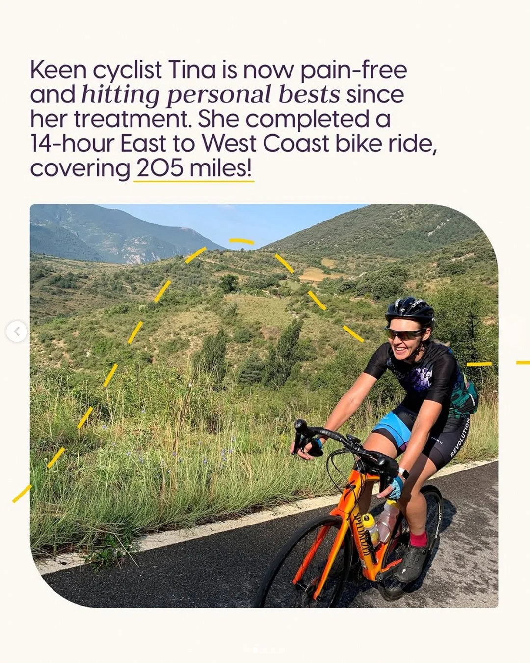
In just three words, I set the new tone for Veincentre, shifting from procedure/problem positioning first to highlighting what everyone who walks into a Veincentre really wants – to Walk Out Happy.
This call to benefits also showcases one of the key reasons for choosing Veincentre: the procedure is so easy you don’t need to be off work, or spend time in hospital – you literally walk out afterwards.
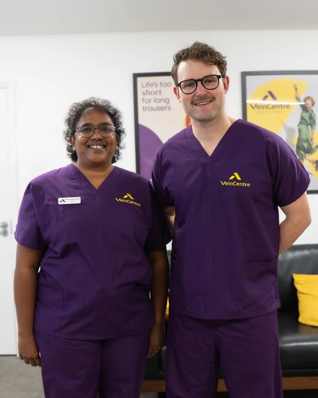
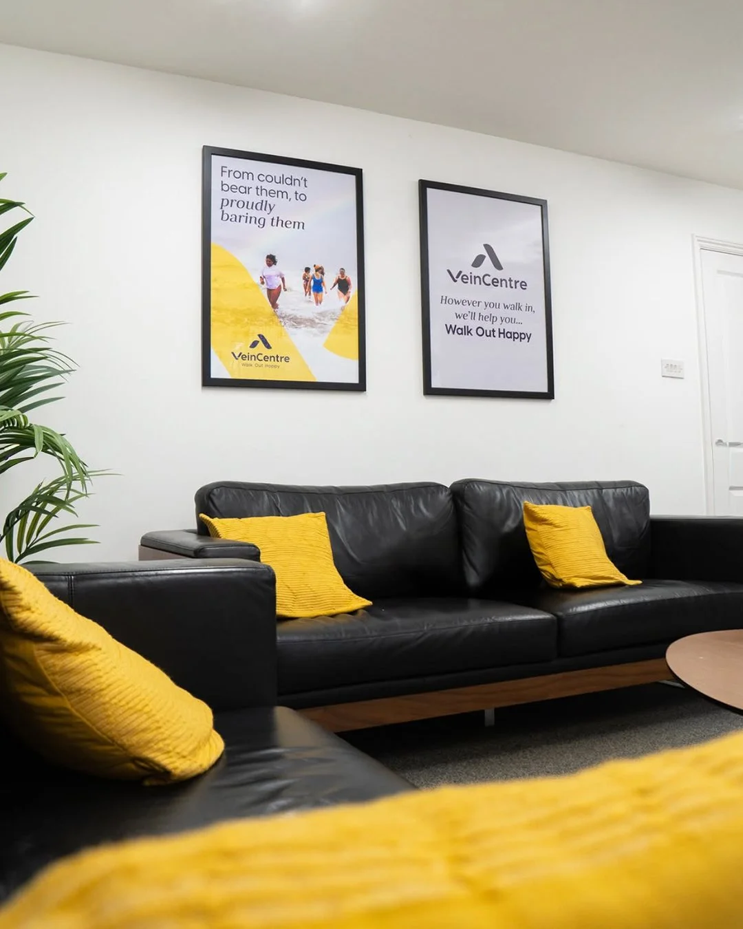
This was all brought to life with a new logo, colour palette and photography. The logo inverted the ‘V’ of Veincentre and rounded the ends to subtly reflect the idea of walking out happy.